Data visualisation (datavis) is the graphical representation of information and data. By utilising visual elements like charts, graphs, and maps, data visualisation tools make it easier to see and understand trends, identify outliers, and recognise patterns in data.
More than just numbers, data visualisation is a form of visual storytelling that captures our attention and effectively communicates key messages. When we look at a chart or graph, we can quickly identify trends and outliers—enabling us to internalise insights rapidly. It’s like storytelling with a purpose, designed to make complex data understandable immediately.
Data visualisation is widely used to spark idea generation across teams, helping to convey strategies, tactics, and processes visually. In many learning environments, datavis supports understanding and decision-making by making data digestible. Within the data science process, it allows teams and individuals to communicate data findings effectively to colleagues and decision-makers.
In this article, we will explore what datavis is, the most popular tools, and some compelling examples. Plus, we include expert insights from analyst Ann K. Emery, who specialises in data visualisation, sharing experiences and best practices from her workshops and seminars around the world.

Why is Data Visualisation Important?
Datavis is essential across every industry. Imagining a field that doesn’t benefit from making data more understandable is challenging. As we move toward a digital era where people rarely have the time to read a 60-page document or sift through countless Excel files, data visualisation transforms complex information into digestible visuals.
But why is it so compelling? Data visualisation simplifies complex data for users, allowing them to absorb insights quickly—often in less than a minute. By translating numbers into clear and impactful visuals, datavis empowers everyone, from beginners to industry experts, to understand trends and make informed decisions.
It is essential to understand that while datavis is widely used, not all data visualisations are effective. It’s one thing to create a graph, but it’s another to design one that’s truly accessible and intuitive.
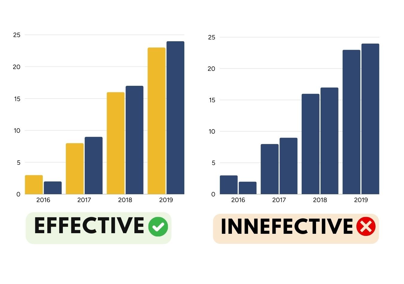
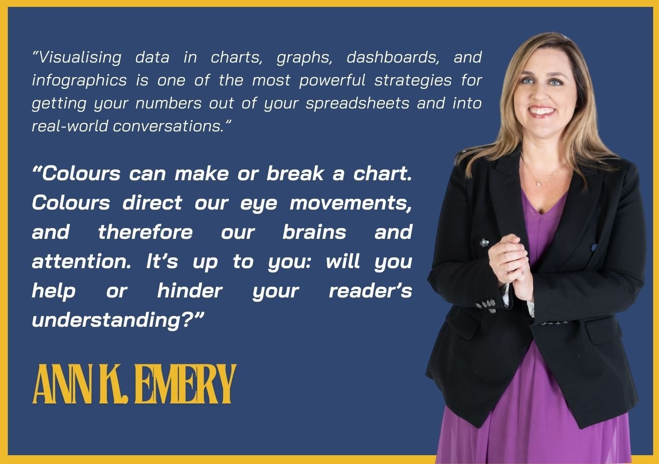
For example, visual elements like colours are crucial for clear visualisation. datavis expert Ann Emery emphasises that “colours can make or break a chart" because they guide our eyes and focus our attention. Emery raises a vital question: Will your data visuals help or hinder understanding?
To avoid ineffective designs, we have included some of the best practices for using brand colours in data visualisation below. You can find more visualisation tips and insights on Depict Data Studio.
- Start with Brand Colours: Align your visualisations with your brand colours to maintain visual consistency across presentations.
- Test for Accessibility: Ensure your visuals are accessible by performing colour blindness and contrast checks and testing grayscale printing so everyone can interpret them.
- Create an Intuitive Design: Select brand colours that enhance readability and improve the intuitive design of your data visualisations.
By following these best practices, you can create impactful, accessible data visuals that support informed decision-making across industries.
See more: “The Data Visualization Design Process: A Step-by-Step Guide for Beginners”.
Data Visualisation Tools
Searching for the best datavis tools to streamline your workflow? We understand that choosing from the wide range of data visualisation software available today can be overwhelming. From free data visualisation tools to premium, paid options, finding the right fit depends on your unique needs.
Selecting the best datavis software for your business involves evaluating the types of data you work with, how visualisation will inform your decisions, and whether you need advanced data visualisation features or a user-friendly data visualisation tool for beginners.
Data Visualisation and AI
Let's address the elephant in the room—will AI replace datavis roles? While some industry experts forecast a potential decline in jobs due to AI data visualisation tools that can create visuals in seconds, leading datavis professionals like Ann K. Emery urge caution when fully depending on these technologies.
Emery emphasises that although AI tools for data visualisation promise rapid results, they lack the creativity and expertise that skilled designers bring to each project. She argues that the efficiency of AI data visualisation tools may hinder the unique insights and innovative designs that only human designers can offer.
On the contrary, many users welcome AI data visualisation tools because of their efficiency; AI, in their opinion, is a supportive tool and never a replacement. Yet, as AI keeps influencing data visualisation, one should remember that complete reliance on AI often restricts creative input. Only when the balance between the use of AI tools and creative insight is struck do people who wish to excel in data visualisation succeed.
If one has the proper data visualisation tool, in particular, powered by AI technology, one can do things in an organised way without sacrificing creativity. Always keep your finger on the pulse with novel data visualisation trends. In the future, as this tool continues to be embraced by more professionals, data visualisation will become a place where both AI capabilities and human creativity are merged to realise impactful, accessible data insights.
Data Visualisation Examples
Data visualisation is a powerful tool for transforming complex data insights into easily understandable visual formats. There are many types of data visualisation, each serving unique functions across different fields and industries. The most commonly used and versatile types include charts, tables, graphs, maps, infographics, and dashboards.
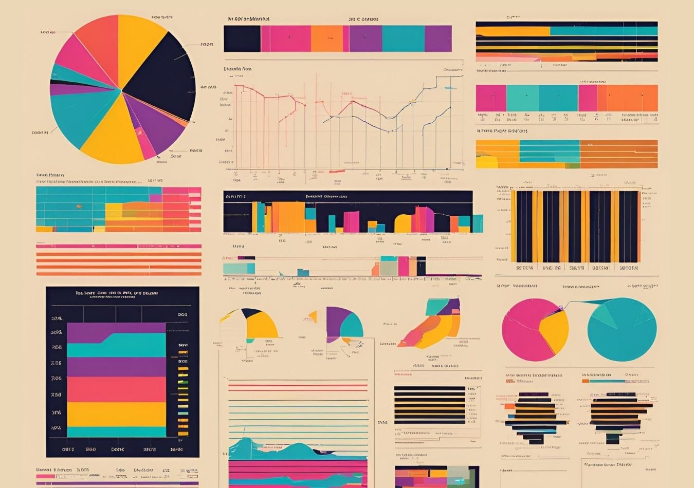
Within these primary types of data visualisations, there are specific formats like heat maps, histograms, matrices, and bar charts. Each format plays a crucial role in making data accessible and enhancing data storytelling by presenting data insights in an engaging and understandable way. The ultimate goal of data visualisation is to make information accessible and insightful for diverse audiences, empowering better decision-making and analysis.
Why is Data Accessibility Important?
In the first episode of our Don’t Panic It’s Just Data series, Don’t Panic, It’s Just Data, we explored this topic of accessibility in depth. You can listen to the episode below to gain insights into how data accessibility can be enhanced.
Listen to the episode below:
In our conversation with Ann K. Emery, we explore the creation of data visualisations that are truly accessible to all. She explains the difference between "big A" accessibility—official guidelines aimed at making visualisations readable for people with disabilities—and "little a" accessibility, which ensures visualisations are engaging and clear for a wider audience.
For “big A” accessibility, Ann offers practical advice, such as avoiding red-green colour pairings and ensuring strong colour contrast to improve readability. For “little a” accessibility, she suggests strategies like using mixed-case text, spotlighting one key data point at a time, and using small multiples to break down complex data.
Ann also envisions a future where data accessibility is built directly into software defaults, making accessibility enhancements seamless and eliminating the need for manual adjustments.
One key takeaway on data visualisation accessibility was that although many people can create a basic bar chart or histogram, not everyone considers the needs of individuals with disabilities or specific visual requirements. For instance, selecting a colour palette that improves readability for all audiences can make data more compelling and effective.





Comments ( 0 )