Our podcasts are changing (a little) this week.
The conversations aren’t. The analysts aren’t. The enterprise focus hasn’t shifted. But the way those conversations are presented is evolving.
What we mean to say is that we’ve reworked the visual and production system behind our podcasts so they better reflect the depth and pace of the discussions themselves. And because our podcasts sit at the centre of the platform, that thinking about our visual identity now extends across everything else we publish.
Updated banners. Refined social graphics. A thumbnail approach built for how B2B audiences actually scan and decide.

This isn’t a cosmetic update.
It’s about aligning how our insight looks with the standard it already meets.
Why We Refined Our Visual Identity
Our podcasts are the core of what we do.
They’re analyst-led. Structured around real enterprise challenges. Built to unpack complexity in AI, security, data, infrastructure, and emerging technologies without reducing them to headlines.
They’re not just repeating what everyone is already saying. They’re working sessions. Strategic conversations. The kind of discussions enterprise leaders use to clarify direction and pressure-test decisions.
That’s exactly why the format matters.
Virtual podcasts can easily slip into a static pattern. Two people on a screen. A logo. A title. Dead space. That default doesn’t reflect the depth or pace of the conversations we host.
That’s never really been our approach. Even in our previous format, we avoided the “talking heads” trap. We highlighted key takeaways on screen. We pulled important points forward visually. We added supporting graphics when something needed clarification or reinforcement. It worked. You don’t build a community of over 25,000 YouTube subscribers by accident.
But the context has shifted.
B2B tech audiences are doing more independent research than ever. They’re watching before they’re reading. They’re prioritising thought leadership and executive insight over promotional content. They’re forming opinions about credibility within seconds. Presentation and substance aren’t separate anymore. They work together.
As our multimedia output expanded across multiple series and formats, we needed a stronger system behind it. Something that still felt unmistakably EM360Tech the moment it appeared on screen, but that also reinforced clarity and authority.
Modern and tech-forward, yes. But still human. Still focused on the conversation. Still built for an enterprise audience that doesn’t have time for noise. And that can be easily scaled as we continue to grow, as well as adapted across our entire platform.
The brief was simple: sharpen the delivery without diluting the insight.
What’s New Across Our Platforms
The shift is easiest to see when you break it down. Each layer of the platform has been refined with the same thinking behind it.
Podcast Video Visual Framework

The biggest shift is our podcast video visual framework.
We’ve introduced new motion graphics, an updated colour palette, and refreshed logo animations that feel cleaner and more current. The framing is tighter too. Less empty space, fewer visual distractions, and a layout that supports the discussion rather than sitting beside it.
The goal wasn’t to overwhelm the viewer with movement. It was to support the conversation in a way that holds attention without distracting from it. So to give the conversation both structure and momentum.
Virtual podcasts need structure to create energy. Small movements. Visual cues. A sense of pace. The new framework is built to do that while keeping the visual hierarchy clear. You should know what you’re watching, who’s speaking, and why it matters, without having to search for it.
Inside 5 Tech Leaders' Playbooks
Explore how leaders at NHS, DHL, Huntress and others use AI, data and cyber strategy to shift enterprise operations, risk posture and workforce impact.
If you’ve followed our shows for a while, you’ll also notice something else. The new system is consistent across series. That’s deliberate. You shouldn’t have to re-learn the visual language every time you watch a different EM360Tech conversation.
Production and Editing Enhancements
Not every improvement is visual.
From an editing perspective, we’ve tightened the structure of each episode so the insight arrives faster and lands more clearly. Enterprise audiences don’t sit through filler. They scan. They evaluate. They decide quickly whether something is worth their time.
That means fewer slow openings. Cleaner transitions between ideas. More deliberate signposting of key points. When an important takeaway surfaces, it’s easier to recognise. When a complex idea needs reinforcing, the pacing supports it rather than burying it.
This isn’t about adding production layers. It’s about removing drag.
When editing works properly, you don’t notice it. You notice that the conversation holds your attention. You follow the thread without effort. And you leave with clearer thinking than when you arrived.
Refreshed Thumbnails

Thumbnails are where most podcasts win or lose attention.
They don’t just need to look good. They need to communicate fast. They need to be legible on a small screen. They need to feel like part of a recognisable system, while still giving each episode its own identity.
Our refreshed thumbnails are designed with that reality in mind.
You’ll notice stronger composition, clearer headline placement, and a more confident visual hierarchy. They’re more visually appealing, but the point isn’t “prettier.” The point is recognisable and scannable. When someone sees an EM360Tech thumbnail, it should register instantly, even before they read the title.
This matters more than ever as podcast discovery becomes increasingly feed-driven. People don’t browse. They scroll. A thumbnail has a split second to earn attention.
New Social and Channel Graphics
The refresh doesn’t stop at video.
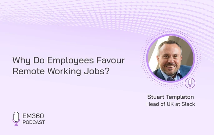
Designing a Digital-First Workplace
How collaboration platforms and remote work models are reshaping workforce policy, equity, and the competition for skilled staff.
We started with the podcast format because that’s where most of our long-form conversations live. But once that direction was defined, it had to translate across everything else we publish.
We’ve updated our banners across LinkedIn, X, and YouTube, and reworked the broader visual system behind our social posts, carousels, and article graphics so they follow the same visual logic.
Our previous banner was intentionally minimal. Clean, white, and neutral. It worked. But it didn’t immediately signal the domains we cover. In fast-moving feeds shaped by dark interfaces and high-contrast media, it blended in more than it should have.
The updated system is more distinctly technology-led. Darker foundations. Structured movement. Higher contrast typography. A visual language that reflects the pace and complexity of AI, security, data, infrastructure, and emerging tech rather than sitting apart from it.
That same foundation now shapes how we present every type of content.
When we break down a framework, the structure is clearer. When we highlight an analyst quote, it holds its weight visually. When we pull out a key statistic or red-flag list, it reads cleanly in-feed without feeling detached from the wider brand.
Whether it’s a podcast clip, an article graphic, a carousel breakdown, or a standalone insight, the presentation now feels like part of the same system.
The design supports the way we explain complex topics. It doesn’t sit beside the content. It reinforces it. And across platforms, the visual identity is consistent because the thinking behind it is consistent.
Built for Scale and Future Series
A refresh only works if it holds up under growth.
One of the biggest goals behind the new podcast visual framework and platform visuals was flexibility. We didn’t want a design that looks great for one series and falls apart when a new format launches. We wanted a system. A recipe.

Podcasting as a CXO Edge
Explore how failing to engage buyers through trusted audio channels can weaken influence in long-cycle enterprise tech deals.
That means we can introduce future series without reinventing the wheel every time. The visual framework stays consistent, while the content and themes can evolve. It’s faster, more scalable, and more coherent for the audience.
That’s also how brand authority is built over time. Not through one bold redesign, but through repeated consistency. You show up the same way, with the same level of polish, across every touchpoint, until people associate that consistency with credibility.
What Hasn’t Changed
The visuals have evolved because the platform has evolved. The substance hasn’t moved.
EM360Tech is still driven by expert-led conversations and enterprise-first insight. We still prioritise depth over noise. We still care about asking the right questions, not just chasing the biggest headlines. And we still measure our success by whether our audience leaves with clearer thinking and better context.
If you’ve ever watched an episode and felt like it gave you language for a problem you were already dealing with, that’s the core of what we do. The new look is there to support that experience, not distract from it.
See the New Look in Action
You may have already noticed some of our changes, but you’ll see the refreshed visual identity rolling out across our latest episodes and social channels in the coming weeks.
The easiest way to truly understand the shift is to watch our recent episode of the Security Strategist and have a look at the updated on-screen format, refined pacing, and new thumbnail style in context for yourself.
And of course, you can follow EM360Tech on LinkedIn, X, and YouTube to stay close to the next wave of conversations - as well as keep an eye on how we implement our new identity across every content format we produce.
Final Thoughts: A Stronger Platform for Enterprise Insight
A sharper look is only worthwhile if it makes the work clearer.
Rewriting Gender Bias in Tech
How leaders can confront implicit bias, reshape culture, and align tech teams with equity goals in an era of hybrid and remote work.
That’s what this refresh is about. A visual identity that matches the quality of the insight. A podcast experience that feels more dynamic, more consistent, and more built for the way B2B audiences actually watch and listen.
The expertise is still the foundation.
Now the delivery is sharper too.


Comments ( 0 )