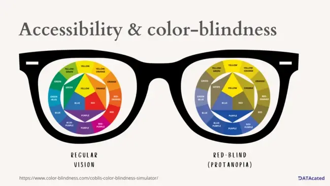
Data visualization is an effective tool for presenting information and insights in a clear and concise manner. However, not everyone perceives colors in the same way. This can be especially challenging for individuals with color vision deficiency (CVD), who have difficulty seeing certain colors or discerning between certain color combinations. This is why it is important for businesses to consider accessibility when designing data visualizations, so that all stakeholders can accurately understand and interpret the information presented.
Colors help to convey information and make it easier to understand. They can be used to highlight important data points, group related data together, and draw attention to patterns or trends. However, when colors are not used correctly, they can also be a hindrance to understanding, especially for individuals with CVD.

CVD is a common condition that affects approximately 8% of men and 0.5% of women in the world. It can result from a variety of causes, including genetic factors and age-related changes to the eyes. The most common form of CVD is red-green color blindness, which affects the ability to distinguish between red and green hues. This can make it difficult to differentiate between similar colors, such as red and brown, or green and yellow.
Accessibility Considerations for Data Visualization
Choose High-Contrast Color Combinations: One of the most important considerations for making data visualizations accessible for individuals with CVD is to choose high-contrast color combinations. This means selecting colors that have a significant difference in lightness and saturation, so that the data can be easily distinguished from the background. For example, black and white, are high-contrast color combinations that can be easily distinguished by people with CVD. There are also specific color palette's that can be leveraged to make your data visualizations more accessible - for example using blue and orange is highly effective (as opposed to red and green).
Avoid Color-Coding Data: Another consideration is to avoid color-coding data, as this can make it difficult for individuals with CVD to understand the information being presented. Instead, consider using other methods, such as patterns or shapes, to distinguish between different data sets. This is especially difficult if you have more than 3-5 colors in your visualization.
Provide Text Descriptions: In addition to visual cues, it is also important to provide text descriptions of the data being presented. This can include call-outs or information about the data sets, as well as any important trends or patterns that are being highlighted. This can help individuals with CVD to better understand the information, even if they are unable to distinguish between certain colors.
As mentioned in the first point above, in the context of CVD, blue and orange can be a good color choice for data visualizations because they offer high contrast and can be easily distinguished by individuals with color vision deficiency. For individuals with red-green color blindness, blue and orange are especially effective as they can be easily differentiated from red and green hues, which are the most difficult colors to distinguish for this population. You can also use a color blindness simulator to view your data visualizations with a CVD lens: e.g. COBLIS.
Color plays a critical role in data visualization and can greatly impact the understanding and interpretation of information. To ensure that data visualizations are accessible for all stakeholders, including individuals with CVD, it is important to consider factors such as high-contrast color combinations, avoiding color-coding data, and providing text descriptions. By doing so, businesses can ensure that their data visualizations are clear, concise, and accessible to all.
This is covered in great detail in my book ColorWise: A Data Storyteller's Guide to the Intentional Use of Color.


Comments ( 0 )